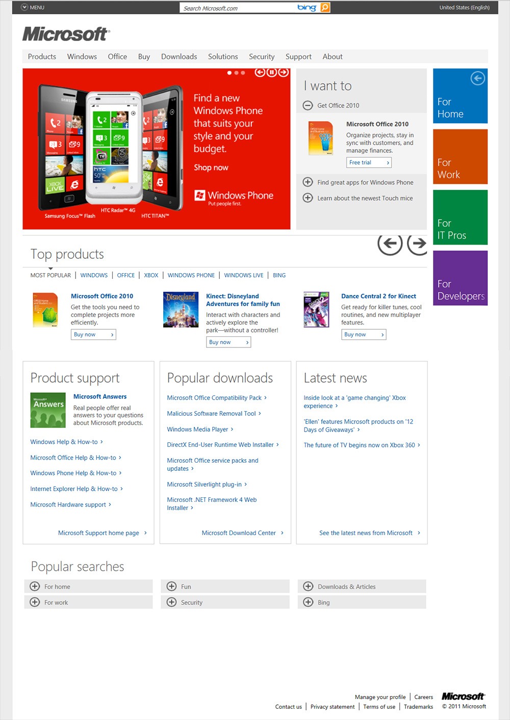
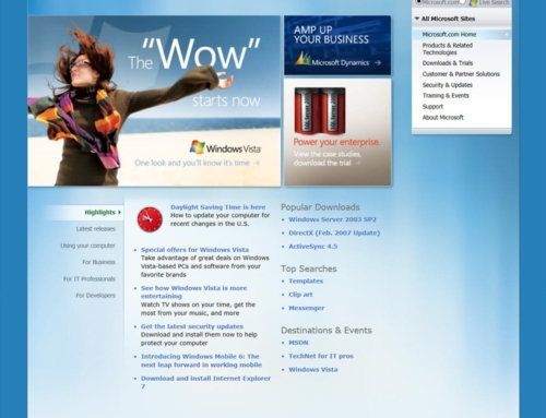
This was the version of the Microsoft.com Home Page in 2011.
Some things to note about the page:
- We had the Bing bar at the top of the page. The launching of the Bing bar across Microsoft.com was actually a really big deal at the time. I remember doing an all night launch across the entire network with a cast of thousands from Engineering and Marketing groups.
- To the right of the page we added categories like For Home, For Work, etc… Clicking on these changed the page content to show relevant information for those categories.
- We added lots of interactive ways to navigate the page. The hero had play/pause buttons with arrows that would navigate from slide to slide. To the right of the hero we added an accordion section that contained big categories of what we thought users would want to do on the page. The Top products section had big arrows to navigate the major product categories.
- We integrate major sections at the bottom from Microsoft Support, Microsoft Downloads, and Microsoft News.
- The “Popular searches” section at the bottom was a way to navigate the site but the primary purpose was to increase SEO for the Microsoft.com Home Page.


